Today we’ll look in more detail at dashboards.
Dashboard
– Overview Scorecard
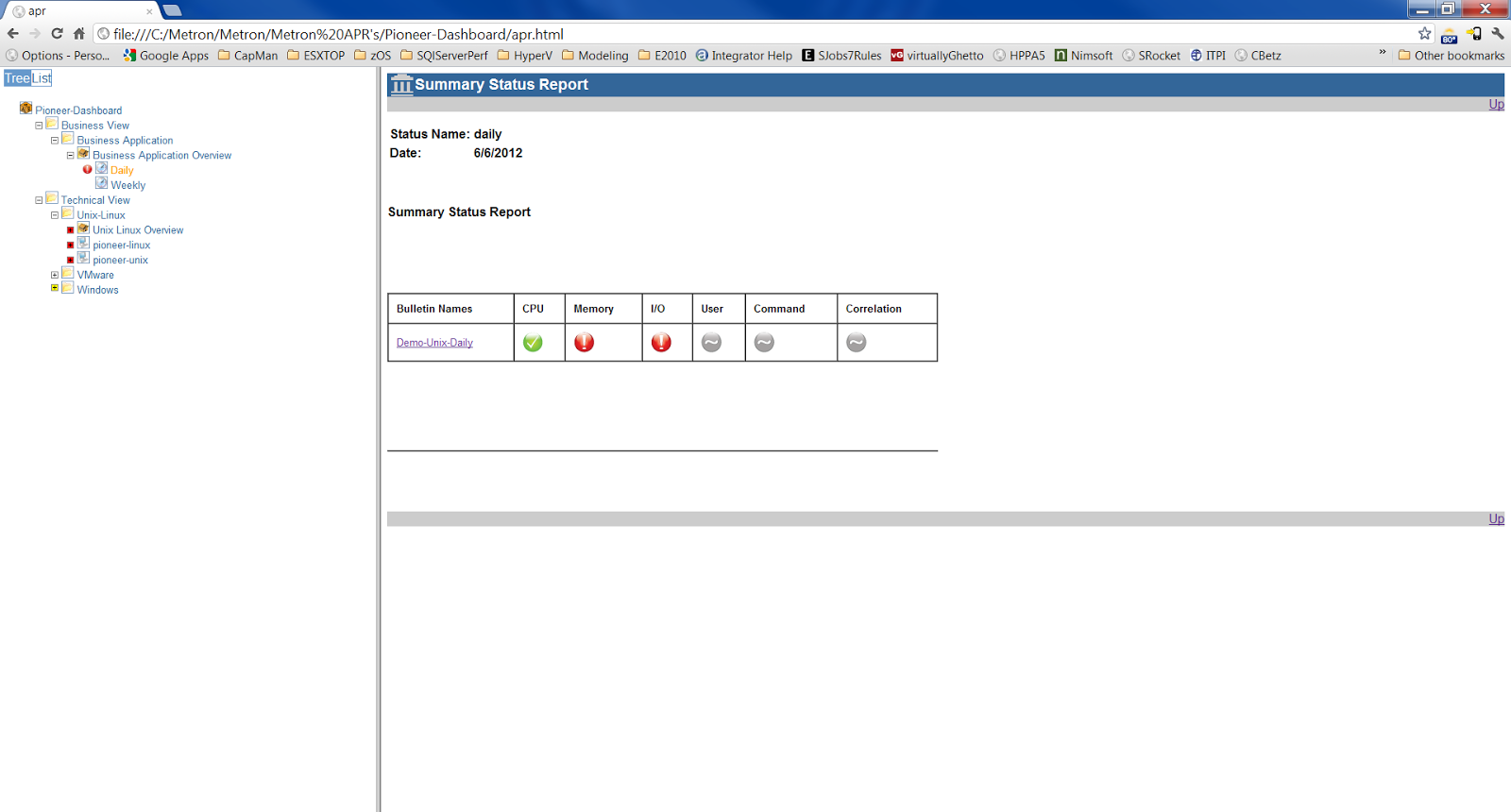
In the following example of
a dashboard we can immediately see that we have a green, 2 reds and some greys.
Based on the green, amber and red status we can immediately see that we have an
issue with a couple of these categories, memory and I/O.
Is this enough information?
Who is viewing this information and does it tell them enough? If management
were looking at this information they would be worried as they can see red in
the status. It does scare senior management when they see a red status, mainly
due to the fact that they do not have the time or inclination to see what is
behind the issue. They would immediately be on the phone to their capacity
management team asking why there are issues and it then causes more pressure
further down the tree.
It may be that this
particular issue is not an immediate problem, maybe one of the thresholds was
breached during a certain time period and needs investigation.
Dashboard
– Overview Scorecard Detail
We can drill down and find
out some further information on the issue in this case.
In the report below there is
still some red showing so it is going to have to be investigated fully and we
would need to drill down even further to find out what applications are
involved here.
In the further drill down report below we can see that we have some
paging activity on Unix that has breached the threshold.
These red, amber and green
scorecards have to be based on thresholds.
Where the grey is shown this
simply means that there is no threshold data attached to that.
We need to get in to the
details to understand what the root cause of the issue is and understand
whether the issue is serious or not.
On Friday I'll show you a couple of examples which have been created for a Linux box.
In the meantime why not join our Community for access to on-demand webinars, white papers, factsheets and more... http://www.metron-athene.com/_downloads/factsheets/index_3.asp
Charles Johnson
Principal Consultant


