Showing posts with label trending. Show all posts

Monday, 31 October 2016

5 Top Performance and Capacity Concerns for VMware - Cluster Trending.

I tend to trend on Clusters the most.
VMs and Resource Pools have soft limits so they are the easiest and quickest to change.
Want to know when you’ll run out of capacity?

       The hardware is the limit

       Trend hardware utilization

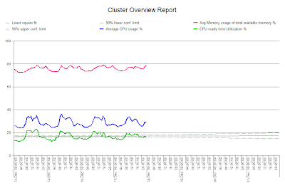
The graph below shows a trend on 5 minute data for average CPU and shows a nice flat trend.


If I take the same data and trend on the peak hour then I see a difference.


You can see that the trend has a steady increase, the peaks are getting larger.

When trending ensure that you trend to cope with the peaks, to deliver immediate value, as these are what you will need to deal with.
Aggregating the Data

Next let’s look at aggregating the data. Previously we looked at Ready Time and as I said Ready Time is accumulated against a virtual machine but you can aggregate this data to see what is going on in the Cluster as a whole.
In the example below CPU utilization is not that busy but there is a steady increase in Ready Time.


The dynamic may be changing and new VM’s that are being created have more CPU’s, which could eventually cause a problem.
I hope you've enjoyed the series and for more VMware white papers and on-demand webinars join our Community and get free access to some great resources.
http://www.metron-athene.com/_resources/login.asp
Phil Bell
Consultant



Tuesday, 12 July 2016

VMware Reports (16 of 17) Capacity Management, Telling the Story

Let’s take a look at some examples of VMware reports.

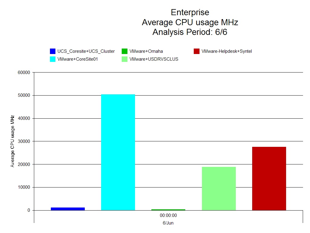
The first report below looks at the CPU usage of clusters in MHz. It is a simple chart and this makes it very easy to understand.
 
VMware – CPU Usage all Clusters

You can immediately see who the biggest user of the CPU is, Core site 01.
 
The next example is a trend report on VMware resource pool memory usage.
The light blue indicates the amount of memory reserved and the dark blue line indicates the amount of memory used within that reservation. This information is then trended going forward, allowing you to see at which point in time the required memory is going to exceed the memory reservation.
 
VMware – Resource Pool Memory Usage Trend
 
A trend report like this is useful as an early warning system, you know when problems are likely to ensue and can do something to resolve this before it becomes an issue.

We need to keep ahead of the game and setting up simple but effective reports, provided automatically, will help you to do this and to report back to the business regarding requirements well in advance.

On Thursday I’ll show you one final report on VMware, which looks at headroom available in the Virtual Center, in the meantime take a look at out VMware vSphere Capacity and Performance Essentials workshop.
http://www.metron-athene.com/services/online-workshops/index.html#vmwarevsphere

Charles Johnson
Principal Consultant

Monday, 20 June 2016

Display of different presentation types (7 of 17) Capacity Management, Telling the Story

As discussed today I'll be looking at the types of presentations that you can use.

Below is a selection of them:


Humans like visual representation so using these charts in the right way and gauging which are right to represent the information to your audience is crucial.

Dashboard More aligned to presenting real time information. The key thing to remember is that any dashboard you use should auto update.


Analysis Presents the drill down of a problem. This is the root cause analysis, where we know there is a problem and we want to drill down and show what is causing the issue. Where’s the bottleneck? Was there a change?

Advice - Provide some automatic advice, automatic interpretation of the data that you are reporting on.

Virtualization - Report on virtualization data, make it easy to understand what  is happening in your virtual environment.

Business We have discussed about bringing in business data to the CMIS. Why do we want to do that? We can look for correlations by measuring component data against business metrics and show these in our business reports.

Trending We can show ‘what-if’ trending which can give you a ‘time to live’ value.

Modeling - More accurate prediction reports to show are modeling reports. You can show things like future system response times or identify where any future bottlenecks are likely to occur.

Breakdown Shows further analysis on the data in an easy to understand way.

Don't forget the key is to always remember to tailor your presentations to suit your audience.

On Wednesday I'll be dealing with what we will see at the management level. 

There's a great webinar coming soon 'Capacity Planning & Forecasting using analytical modeling', don't miss it!
http://www.metron-athene.com/services/webinars/index.html

Charles Johnson
Principal Consultant


Monday, 27 July 2015

Forecasting, when modeling is not the only choice - Forecasting Techniques (3 of 5)

In my opinion there are four main techniques that are used in forecasting: analytical modeling, simulation modeling, trending and headroom charts.

Let’s take a look at each of these:
Analytical Modeling                                        

        The ability to predict environment changes based upon the arrival of work
·      CPU
·      IO
        Based upon
·      Baseline timeframe (seasonal peaks and troughs, highest transaction times etc)
·      Calibration of model – Does it match real life?
·      What-If changes to model
        Spend virtual $’s, helping you to determine what is the best cost benefit that you can get out of it
        Low cost modeling technique, as you’re able to take the data and apply it going forward without making costly mistakes.
The graph below illustrates how this can be considered, always taking in to account how the ‘end user’ will be affected.
Simulation Modeling
There are many organizations such as Wall Street companies, who feel the need to run simulation models but it does take longer to set up and can be very costly.
        Replication of environment
        Has to stay close to production environment
        Usage of tools to replicate workload into simulated environment
        Longer lead time to setup
        Provides granular detail on environment changes
        Can be costly
Trending
With trending you are usually looking at one metric for each chart, this doesn’t prohibit you from having several charts looking at different metrics for the same scenario.
        Provide prediction based upon an interval of time
        Quick to produce
        Usually looking at one metric
        Can show steps in growth changes
        Confidence is based on length of interval and amount of historical data
The more data that you have to feed in to your trend chart then the more confidence you can have in the end result.
On Wednesday I'll be taking a more in-depth look at Trend types.
Charles Johnson
Principal Consultant