Monday 30 November 2015

Idle VMs - Why should we care? (2 of 3)

In my previous blog I mentioned the term VM Sprawl and this is where Idle VMs are likely to factor. 


Often VMs are provisioned to support short term projects,  for development/test processes or for applications which have now been decommissioned.  Now idle, they’re left alone, not bothering anyone and therefore not on the Capacity and Performance teams radar.

Which brings us back to the question.  Idle VMs - Why should we care? 
We should care, for a number of reasons but let's start 
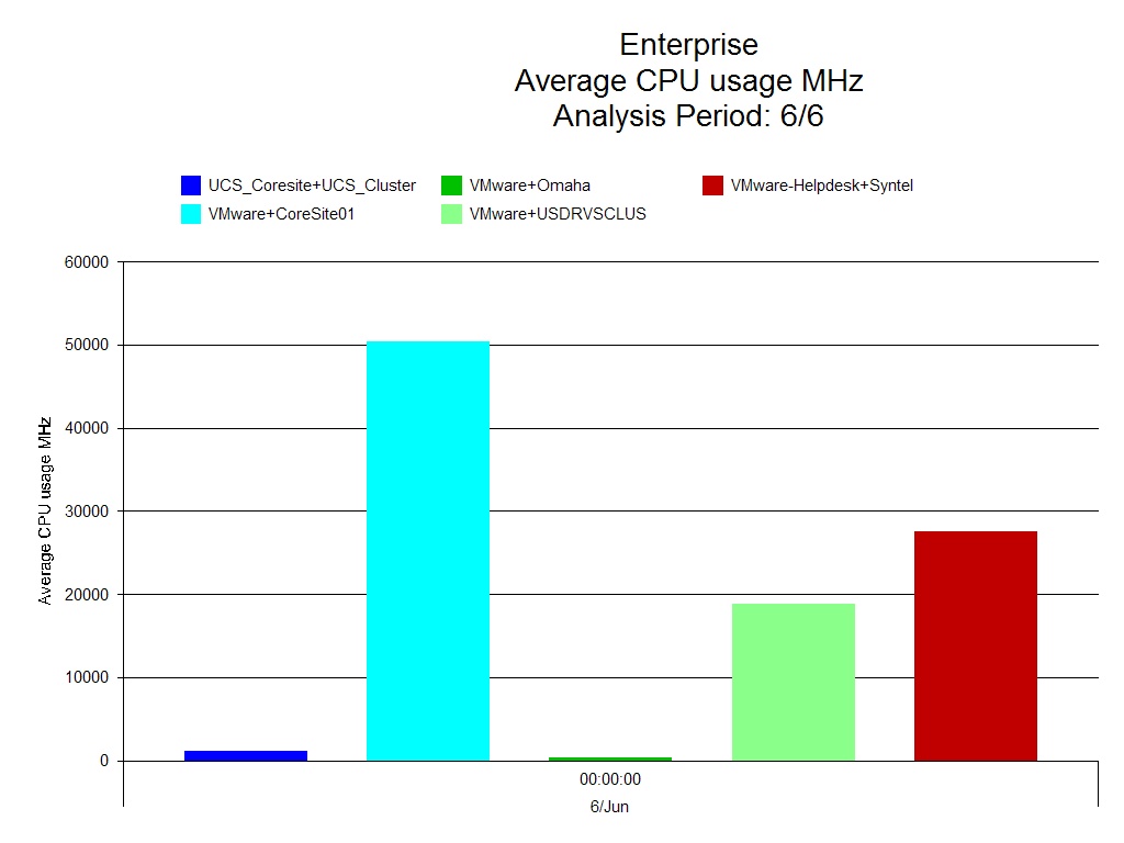
with the impact on CPU utilization.

When VMs are powered on and running, timer interrupts have to be delivered from the host CPU to the VM.  The total number of timer interrupts being delivered depends on the following factors:

·       VMs running symmetric multiprocessing (SMP), hardware abstraction layers (HALs)/kernels require more timer interrupts than those running Uniprocessor HALs/Kernels.

·       How many virtual CPUs (vCPUs) the VM has.

Delivering many virtual timer interrupts can negatively impact on the performance of the VM and can also increase host CPU consumption.  This can be mitigated however, by reducing the number of vCPUs which reduces the timer interrupts and also the amount of co-scheduling overhead (check CPU Ready Time). 

Then there's the Memory management of Idle VMs.  Each powered on VM incurs Memory Overhead.   The Memory Overhead includes space reserved for the VM frame buffer and various virtualization data structures, such as Shadow Page Tables (using Software Virtualization) or Nested Page Tables (using Hardware Virtualization).  This also depends on the number of vCPUs and the configured memory granted to the VM.

We’ll have a look at a few more reasons to care on Wednesday, in the meantime why not complete our Capacity Management Maturity Survey and find out where you fall on the maturity scale. http://www.metron-athene.com/_capacity-management-maturity-survey/survey.asp
Jamie Baker
Principal Consultant

Friday 27 November 2015

Idle VM's - Why should we care? (1 of 3)

The re-emergence of Virtualization technologies, such as VMware, Microsoft's Hyper-V, Xen and Linux KVM has provided organizations with the tools to create new operating system platforms ready to support the services required by the business, in minutes rather than days. 
Indeed IT itself is a service to the business.

In more recent times, Cloud computing which in itself is underpinned by Virtualization, makes use of the functionality provided to satisfy :
  • on-demand resources
  •           the ability to provision faster
  •           rapid elasticity (refer to NIST 's description of Cloud Computing)
     Cloud computing makes full use of the underlying clustered hardware. Constant strides are being made by Virtualization vendors to improve the Virtual Machine (VM) to Host ratio, without affecting the underlying performance. 
But, you may ask "What's this got to do with Idle VMs?"

Well, as I described earlier Virtualization provides the means to easily and quickly provision virtual systems. Your CTO/CIO is going to demand a significant ROI once  an investment in both the hardware and virtualization software has been made, possibly switching the focus to an increase in the VM to Host ratio. 

“What's wrong with that?” I hear you say.  Nothing at all, as long as you keep track of what VMs you are provisioning and :

  •          what resources you have granted
  •          what they are for

Failure to do so will mean that your quest for a good ROI and a satisfied Chief will be in jeopardy, as you’ll encounter a term most commonly known as VM Sprawl.
More about this on Monday.
In the meantime why not register for my webinar VMware Capacity Planning'

Jamie Baker

Principal Consultant

Monday 23 November 2015

VMware – Virtual Center Headroom (17 of 17) Capacity Management, Telling the Story


Today I’ll show you one final report on Vmware, which looks at headroom available in the Virtual Center.

In the example below we’re showing CPU usage. The average CPU usage is illustrated by the green bars, the light blue represents the amount of CPU available across this particular host and the dark blue line is the total CPU power available.

VMware – Virtual Center Headroom
We have aggregated all the hosts up within the cluster to see this information.
We can see from the green area at the bottom how much headroom we have to the blue line at the top,although actually in this case we will be comparing it to the turquoise area as this is the amount of CPU available for the VM’s.
This is due to the headroom taken by VMkernel which has to be taken in to consideration and explains the difference between the dark blue line and the turquoise area.
Summary

To summarize my blog series, when reporting:

        Stick to the facts

        Elevator talk

        Show as much information as needs to be shown

        Display the information appropriate for the audience

        Talk the language for the audience

….Tell the Story

Sign up to our Community and get access to all our Resources, on-demand webinars, white papers and more....
http://www.metron-athene.com/_resources/on-demand-webinars/login.asp

Charles Johnson
Principal Consultant

Friday 20 November 2015

VMware Reports (16 of 17) Capacity Management, Telling the Story


Let’s take a look at some examples of VMware reports.

The first report below looks at the CPU usage of clusters in MHz. It is a simple chart and this makes it very easy to understand.

VMware – CPU Usage all Clusters

You can immediately see who the biggest user of the CPU is, Core site 01.
The next example is a trend report on VMware resource pool memory usage.
The light blue indicates the amount of memory reserved and the dark blue line indicates the amount of memory used within that reservation. This information is then trended going forward, allowing you to see at which point in time the required memory is going to exceed the memory reservation.
VMware – Resource Pool Memory Usage Trend
A trend report like this is useful as an early warning system, you know when problems are likely to ensue and can do something to resolve this before it becomes an issue.

We need to keep ahead of the game and setting up simple but effective reports, provided automatically, will help you to do this and to report back to the business regarding requirements well in advance.

On Monday I’ll show you one final report on Vmware, which looks at headroom available in the Virtual Center, in the meantime take a look at out Capacity Management Maturity workshop http://www.metron-athene.com/services/online-workshops/index.html

Charles Johnson
Principal Consultant

Wednesday 18 November 2015

Model – Linux server change & disk change (15 of 17) Capacity Management, Telling the Story

Following on from Monday's blog today I'll show the model for change in our hardware.

In the top left hand corner we are showing that once we reach the ‘pain’ point and then make a hardware upgrade the CPU utilization drops back to within acceptable boundaries for the period going forward.


In the bottom left hand corner you can see from the primary results analysis that the upgrade would mean that the distribution of work is more evenly spread now.

The model in the top right hand corner has bought up an issue on device utilization with another disk so we would have to factor in an I/O change and see what the results of that would be and so on.

In the bottom right hand corner we can see that the service level has been fine for a couple of periods and then it is in trouble again, caused by the I/O issue.

Whilst this hardware upgrade would satisfy our CPU bottleneck it would not rectify the issue with I/O, so we would also need to upgrade our disks.

When forecasting modeling helps you to make recommendations on changes that will be required and when they will need to be implemented.

On Friday I'll take a look at some examples of VMware reports.

Charles Johnson
Principal Consultant


Monday 16 November 2015

Modeling Scenario (14 of 17) Capacity Management, Telling the Story


I have talked about bringing your KPI’s, resource and business data in to a CMIS and about using that data to produce reports in a clear, concise and understandable way.
 Let’s now take a look at some analytical modeling examples, based on forecasts which were given to us by the business.
Below is an example of an Oracle box, we have been told by the business that we are going to grow at a steady rate of 10% per month for the next 12 months. We can model to see what the impact of that business growth will be on our Oracle system. 

In the top left hand corner is our projected CPU utilization and on the far left of that graph is our baseline. You can see that over a few months we begin to go through our alarms and our thresholds pretty quickly.


Model – oracleq000 10% growth – server change


In the bottom left hand corner we can see where bottlenecks will be reached indicated by the large red bars which indicate CPU queuing.
On the top right graph we can see our projected device utilization for our busiest disk and we can see that within 4 to 5 months it is also breaching our alarms and thresholds.
Collectively these models are telling us that we are going to run in to problem with CPU and I/O.
In the bottom right hand graph is our projected relative service level for this application. In this example we started the baseline off at 1 second, this is key.


By normalizing the baseline at 1 second it is very easy for your audience to see the effect that these changes are likely to have. In this case, once we’ve added the extra workload we can see that we go from 1 second to 1.5 seconds (a 50% increase) and then jumped from 1 second to almost 5 seconds. From 1 to 5 seconds is a huge increase and one that your audience can immediately grasp and understand the impact of.

We would next want to show the model for change in our hardware and I'll be looking at this on Wednesday.

Wednesday is also the day of our 'Essential Reporting' webinar, if you haven't registered for your place there's still time to.

Charles Johnson
Principal Consultant


Friday 13 November 2015

Business Metric Correlation (13 of 17) Capacity Management, Telling the Story

As mentioned previously it is important to get business information in to the CMIS to enable us to perform some correlations.

As in the example below we have taken business data and taken component data and we can now report on this together to see if there is some kind of correlation.

Business Transactions vs. CPU Utilization
In this example we can see that the number of customer transactions(shown in dark blue) reasonably correlates with the amount of CPU utilization.
Can we make some kind of judgment based on just what we see here? Do we need to perform some further statistical analysis on this data? What is the correlation co-efficiency for our application data against the CPU utilization?
Closer to the value of 1 indicates that there is a very close correlation between the application data and the underlying component data.
What can we do with this information back to the business? An example would be: This graph indicates that there is a very close correlation between the number of customer transactions and the CPU utilization. Therefore, if we plan on increasing the number of customer transactions in the future we are likely to need to do a CPU upgrade to cope with that demand.
On Monday I'll be looking at a Modeling scenario.
Charles Johnson
Principal Consultant

Wednesday 11 November 2015

Linux Server – Disk Utilization (12 of 17) Capacity Management, Telling the Story

Below is an example of a report on disk utilization of a Linux server. The reason I chose to share this report is that it is an instance based report, displaying the top 5 disks and their utilization on this system.

You have the ability to pick out our top 5 or our bottom 5 to display to your audience because we don’t want too much ‘noise’ on our chart.


We want to keep things clear and concise, don’t flood reports with meaningless data and keep it relevant to our audience.

On Friday I'll be discussing Business Metric Correlation and why it's important to view business and component data together.

Don't miss out on our 'Essential Reporting' webinar, register now.
http://www.metron-athene.com/services/webinars/index.html

Charles Johnson
Principal Comsultant

Monday 9 November 2015

Unix Reports - Capacity Management – Telling the Story (11 of 17)

As promised today we'll be looking at a Unix report, let’s begin with an example which has been created for a Linux box.

Below is a simple utilization report for a Linux box running an application, it is for a day and it shows us that there are a couple of spikes where it has breached our CPU threshold.

Linux Server - CPU Utilization


Looking at this report we can see that these peaks take place during the middle of the day. Is that normal behavior? Do you know enough about the system or application that you are reporting on to make that judgment? Do we need to perform a root cause analysis? If we believe the peaks to be normal then maybe we need to adjust the threshold settings or if we are unsure then we need to carry out further investigation. Has some extra load been added to the system? Has there been a change? Are there any other anomalies that you need to find out about?

Remember when reporting don’t make your reports over complicated.

Don’t put too much data on to one chart, it will look messy and be hard to understand.

On Wednesday I'll be talking about Disk Utilization on a Linux server, in the meantime sign up for our 'Essential reporting' webinar on Nov 18

Charles Johnson
Principal Consultant


Friday 6 November 2015

Dashboard (10 of 17) Capacity Management, Telling the Story

Dashboard – Overview Scorecard

In the following example of a dashboard we can immediately see that we have a green, 2 reds and some greys. Based on the green, amber and red status we can immediately see that we have an issue with a couple of these categories, memory and I/O.


Is this enough information? Who is viewing this information and does it tell them enough? If management were looking at this information they would be worried as they can see red in the status. It does scare senior management when they see a red status, mainly due to the fact that they do not have the time or inclination to see what is behind the issue. They would immediately be on the phone to their capacity management team asking why there are issues and it then causes more pressure further down the tree.
It may be that this particular issue is not an immediate problem, maybe one of the thresholds was breached during a certain time period and needs investigation.
Dashboard – Overview Scorecard Detail
We can drill down and find out some further information on the issue in this case.
In the report below there is still some red showing so it is going to have to be investigated fully and we would need to drill down even further to find out what applications are involved here.
In the further drill down report below we can see that we have some paging activity on Unix that has breached the threshold.

These red, amber and green scorecards have to be based on thresholds.
Where the grey is shown this simply means that there is no threshold data attached to that.
We need to get in to the details to understand what the root cause of the issue is and understand whether the issue is serious or not.
On Monday I'll be taking a closer look at Unix reports. In the meantime why not take a few minutes and complete our online Capacity Management Maturity Survey to find out where you fall on the Maturity Scale and receive a 20 page report for free.
Charles Johnson
Principal Consultant

Wednesday 4 November 2015

Resources and Costs (9 of 17) Capacity Management, Telling the Story

The report below is a dashboard view of resources and costs.

In the top left hand corner we have a cost by application. This is a breakdown of our applications and how much each of these is actually costing us. In this instance the biggest cost to us is development.

In the top right hand corner is an analysis of how much memory each of our applications is using and again it is development who are consuming the most memory resources.
In the bottom left hand corner we can view the sum of the CPU, this is the usage of the CPU by the application and in this case an in-house application is consuming the most CPU.
In the bottom right hand corner we have the numbers of CPU’s that are being used by applications and again in this example development are using the largest amount.
This is a very clear and concise way of displaying the information to your audience.
On Friday we’ll look in more detail at dashboards.
Charles Johnson
Principal Consultant

Monday 2 November 2015

Management Overview Applications (8 of 17) Capacity Management, Telling the Story


Let’s move on to what we will see at the management level, particularly for applications. This is called an application summary.
The example summary below shows grouping by category, in this instance by location.
We have a call center, a warehouse, datamart and sales and it shows you that horizontal scale progress through use of color. For each arrival workflow that we have coming in it shows you the progress.
Application Summary

As you can see there are some reds being displayed in this report, the comment section clearly describes what these issues are.
This allows you to clearly display to management the issues, what is causing them and enables you to discuss with them what you are doing about it.
In this case, the warehouse needs some new architecture.
On Wednesday I'll be discussing resources and costs, in the meantime sign up to our Community and get access to our resources - white papers, Techtips and on-demand webinars.http://www.metron-athene.com/_resources/index.html

Charles Johnson
Principal Consultant