Most computer performance analysts will be interested in both the average load that a given server needs to support, and the peak load. As is widely recognized, any server supporting a customer-facing application needs to be responsive at peak times – the dreaded alternative is loss of business to competitors who are only a click away.
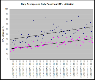
The following picture shows the measured CPU utilization of a particular server, with points for both the daily average utilization, and the utilization during the peak hour each day. Separate trend lines have been fitted to the daily average value and to each day’s peak hour.
At the start of the time period, see that the trend line for the daily peak is about 19 percentage points higher than the trend line for the daily average. However, by the end of the time period, the trend line for the peak values is about 25 percentage points higher than the average trend – in other words, these two trend lines are diverging. The peaks are rising faster than the average value. Depending on your requirements, you may want to track the average, or the “average peaks”, or the “peak peaks”.
Lesson 2 – you may well need to use more than one trend line to adequately describe changes in a single variable.
I'll be completing my series with a look at soft and hard trend limits this Friday.
Andy Mardo
Product Manager


No comments:
Post a Comment